Swift Default List Content Configurations
By Stefan Schmitt · 2022-12-11
Building a list with a collection view comes down to two configuration objects working together: one decides the section's overall look, the other decides what each row contains. They're easy to mix up because both have "configuration" in the name, so it's worth separating them before looking at the presets.
UICollectionLayoutListConfiguration(appearance:)sets the section —plain,grouped,insetGrouped, orsidebar. It's the collection-view answer toUITableView.Style, withsidebaradded for source-list UIs.UIListContentConfigurationsets the cell — its presets (.cell(),.subtitleCell(),.valueCell(),.accompaniedSidebarCell(), and.header()/.footer()for supplementary views) decide where the text, secondary text, and image sit. You usually start fromcell.defaultContentConfiguration(), which hands back the preset that matches the current appearance.
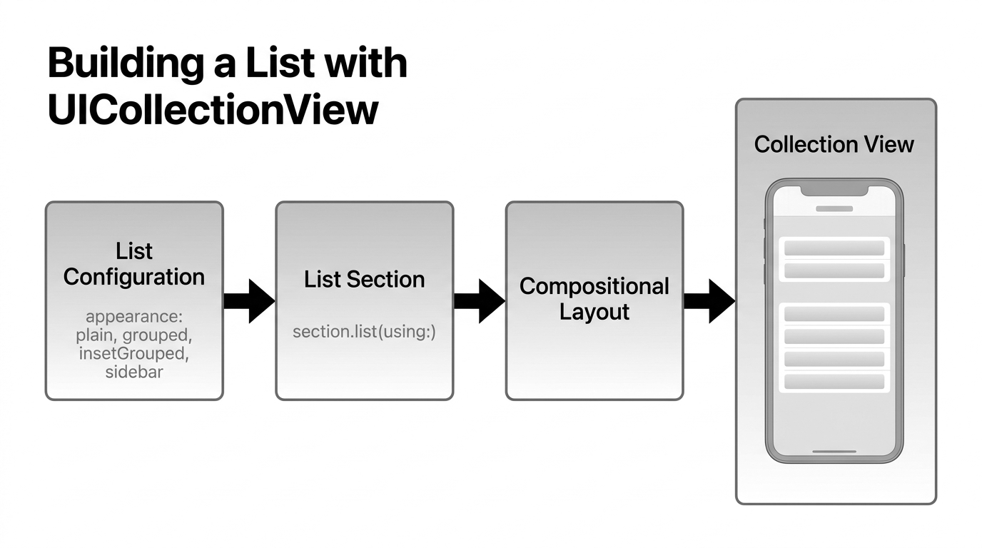
Wiring it up is short:
// 1. The section appearance
let config = UICollectionLayoutListConfiguration(appearance: .insetGrouped)
let layout = UICollectionViewCompositionalLayout.list(using: config)

// 2. The cell content, inside a cell registration
let registration = UICollectionView.CellRegistration<UICollectionViewListCell, Item> { cell, _, item in
    var content = UIListContentConfiguration.valueCell()   // or .cell(), .subtitleCell(), .sidebarCell()…
    content.text = item.title
    content.secondaryText = item.detail
    cell.contentConfiguration = content
}
The screenshots below show the default content-configuration presets — cell, subtitleCell, valueCell, and the header/footer variants — rendered in each appearance, so you can see how the same presets shift with the section style.
Appearance plain ↴
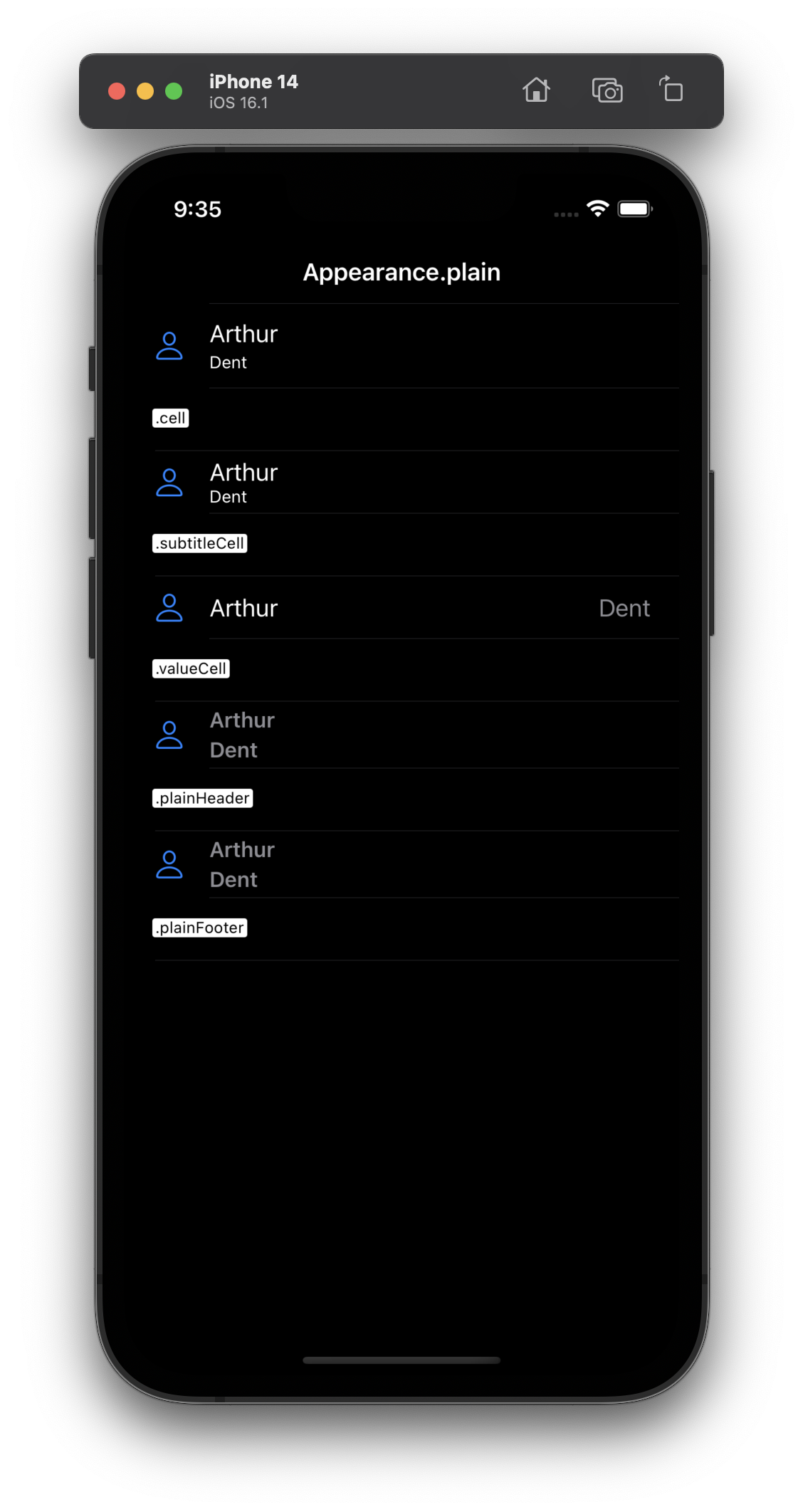
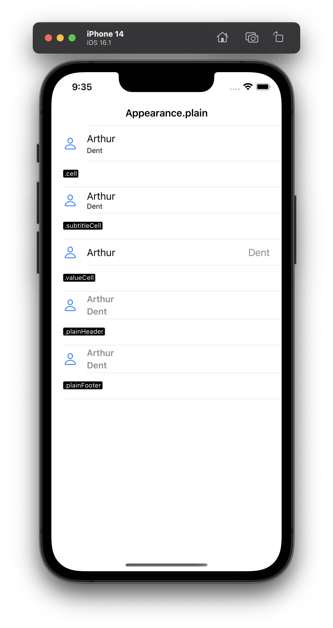
Edge-to-edge rows with sticky section headers — the everyday list. The presets here (cell, subtitleCell, valueCell, plainHeader, plainFooter) are the ones you'll reach for most.
Appearance grouped ↴
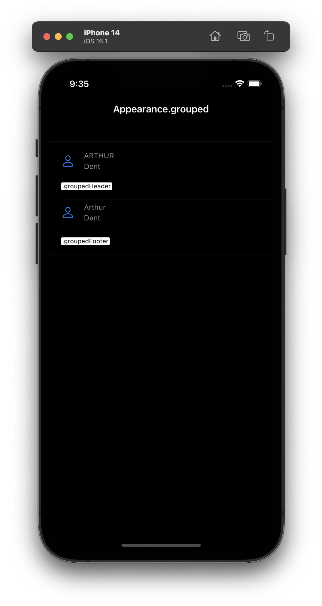
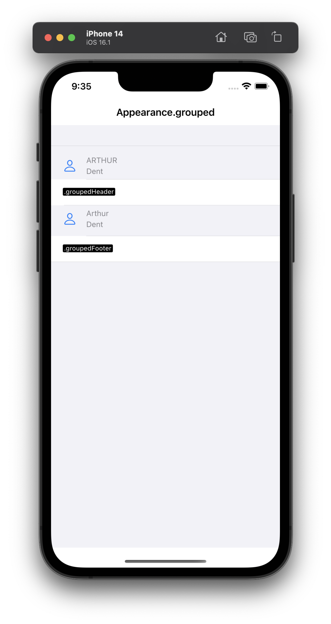
Full-width rows gathered into spaced sections, with headers that scroll along with the content — the classic settings-style grouping.
Appearance insetGrouped ↴
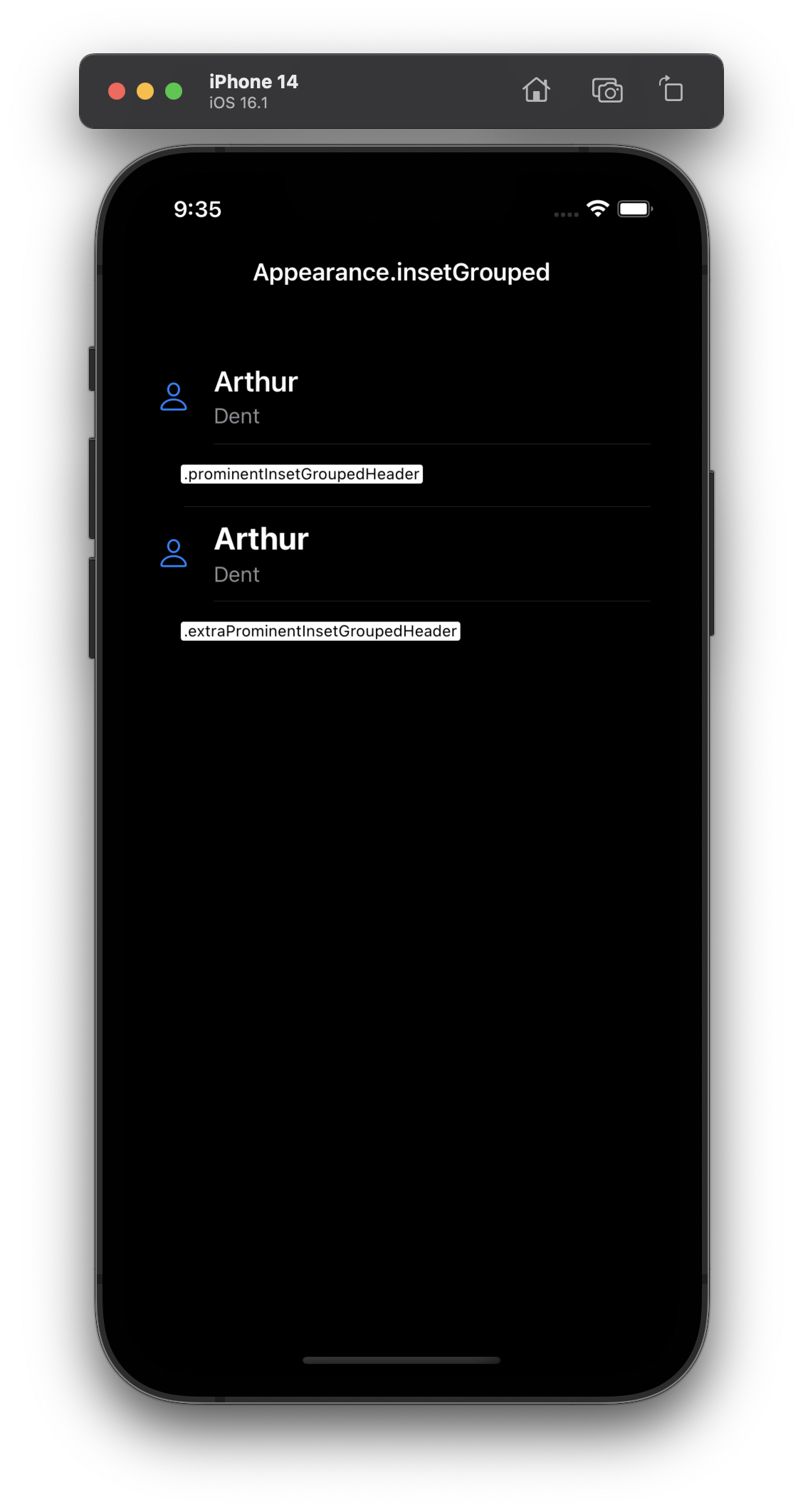
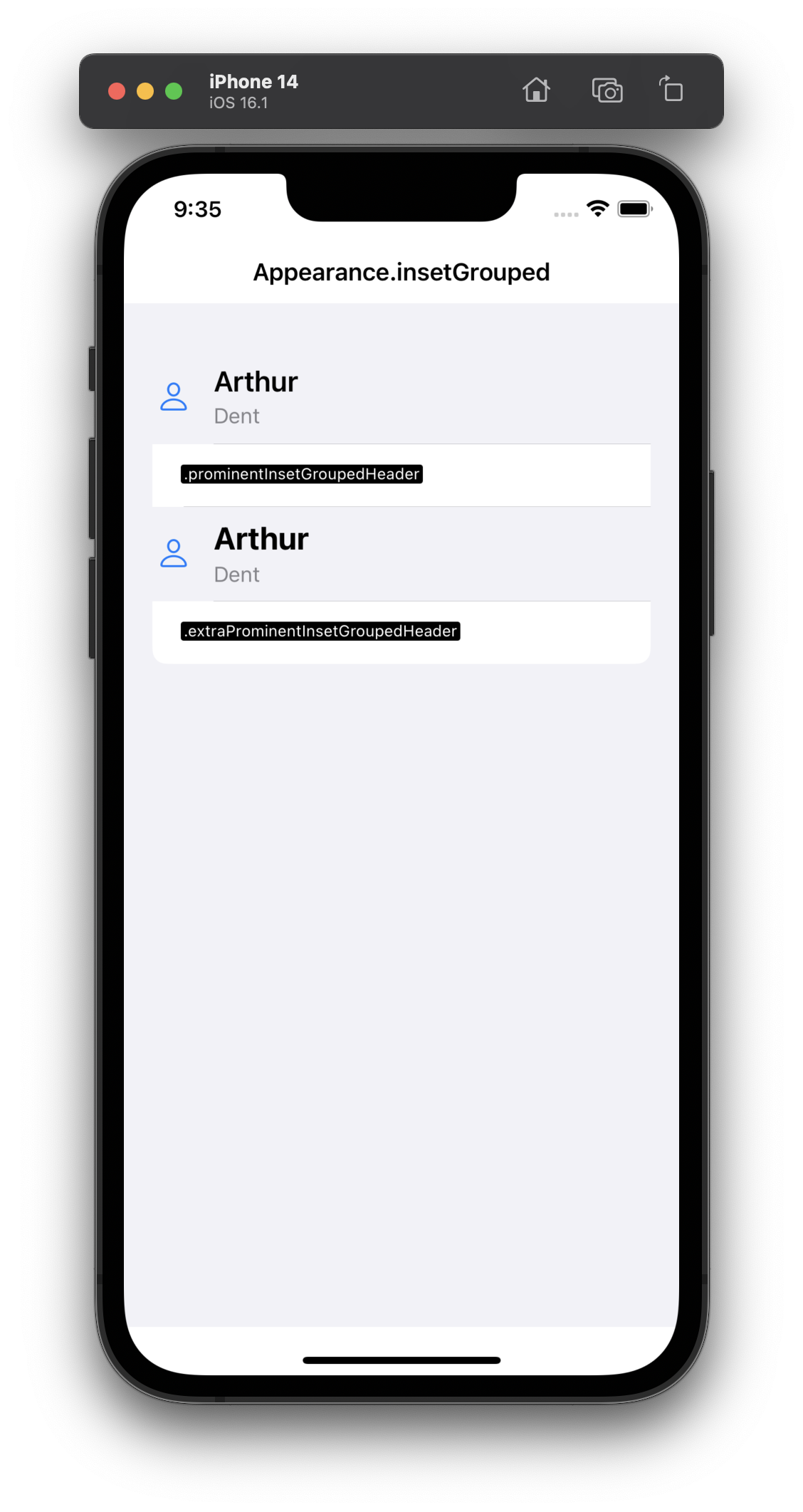
grouped with the rows pulled into rounded cards inset from the edges — the modern Settings look, and a good default for forms.
Appearance sidebar ↴
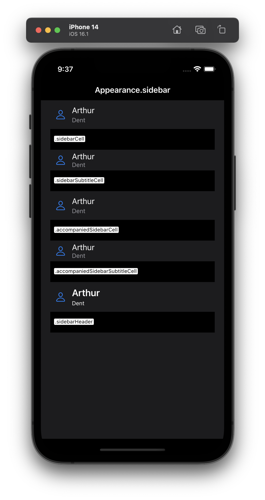
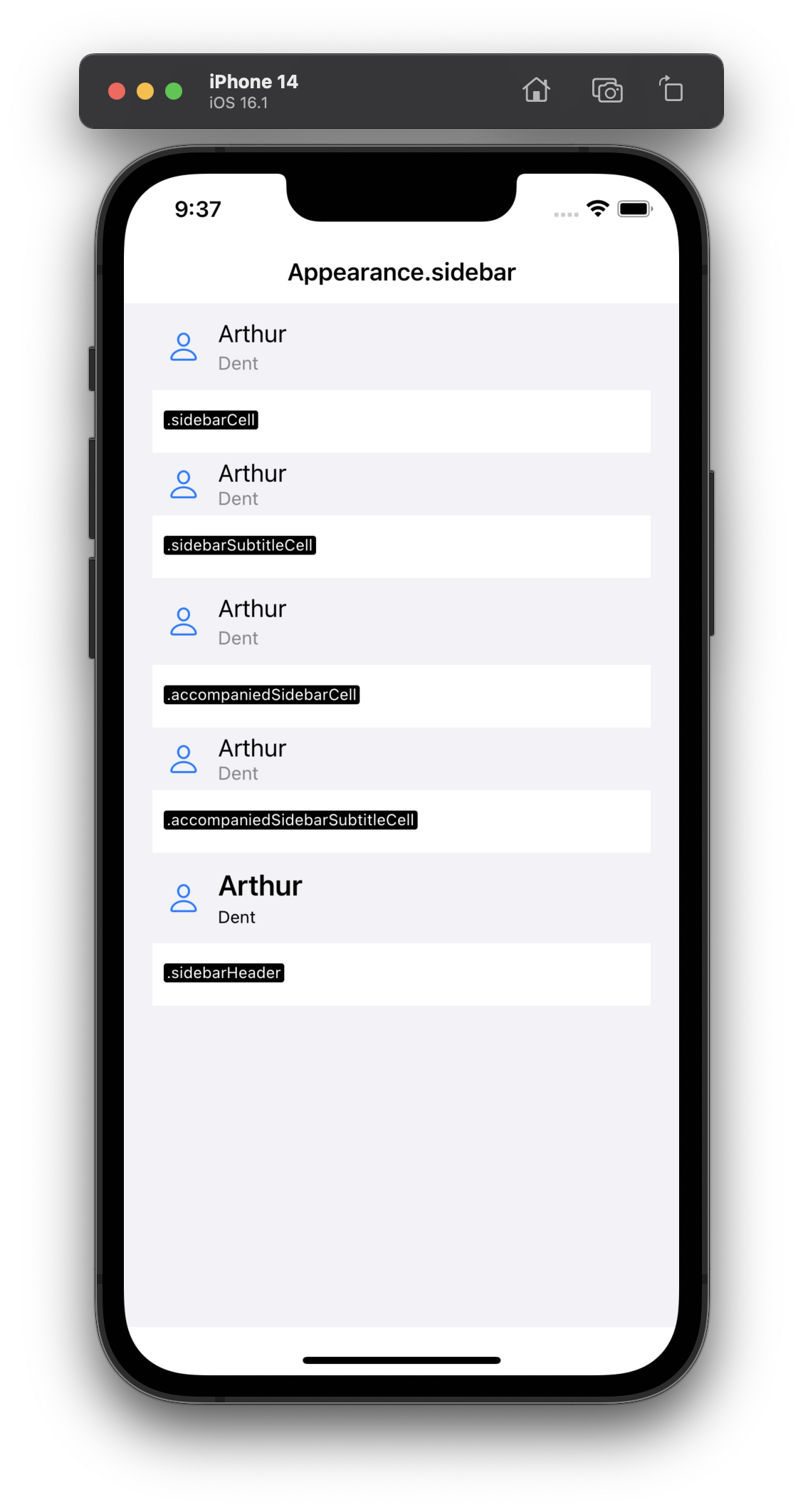
The appearance for source lists and navigation sidebars — think the iPad Files or Notes sidebar: collapsible sections and the sidebarCell / sidebarHeader presets, which sit tighter and lighter than their plain counterparts.
Source repo used to generate the windows in the images above.