Default UITableView styles
By Stefan Schmitt · 2023-11-15
The style you pass into a UITableView is the first decision you make about it — and the easiest one to make on autopilot. It's a single argument at init, but it sets the whole personality of the screen: whether rows run edge to edge, whether sections float as rounded cards, how headers behave when you scroll. There are three built-in styles. Here's what each one actually looks like, and when I reach for it.
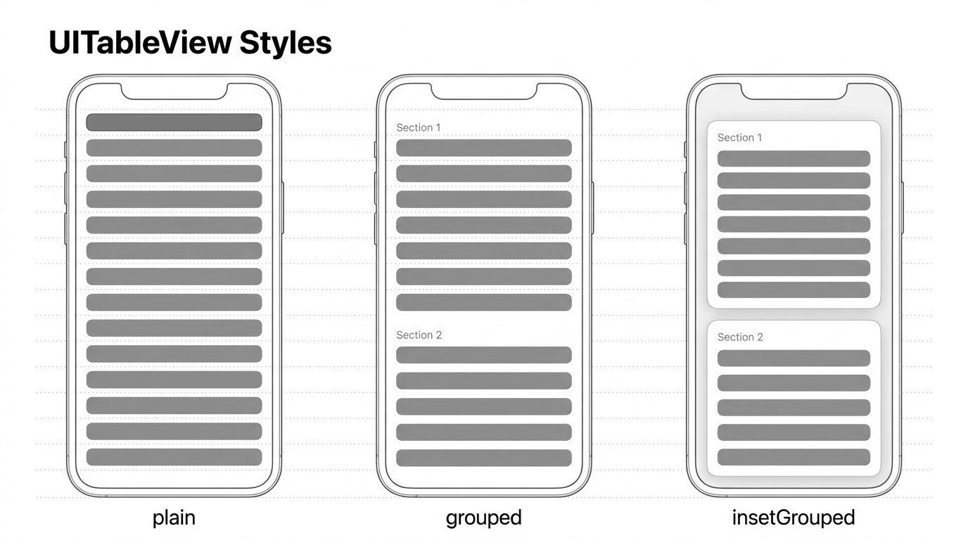
All three arrange the same cells; what changes is how they treat sections and edges. plain is one continuous list. grouped and insetGrouped both break the list into visually distinct sections — the difference between them is whether those sections span the full width or float inset with rounded corners.
Appearance plain ↴
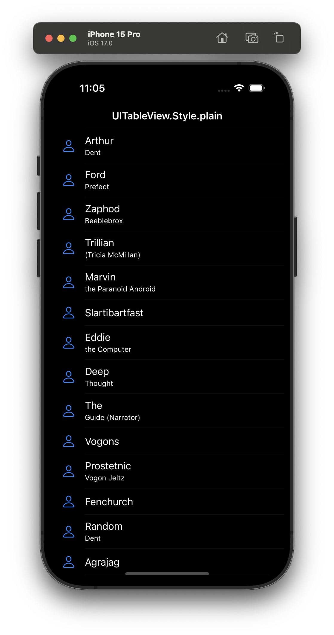
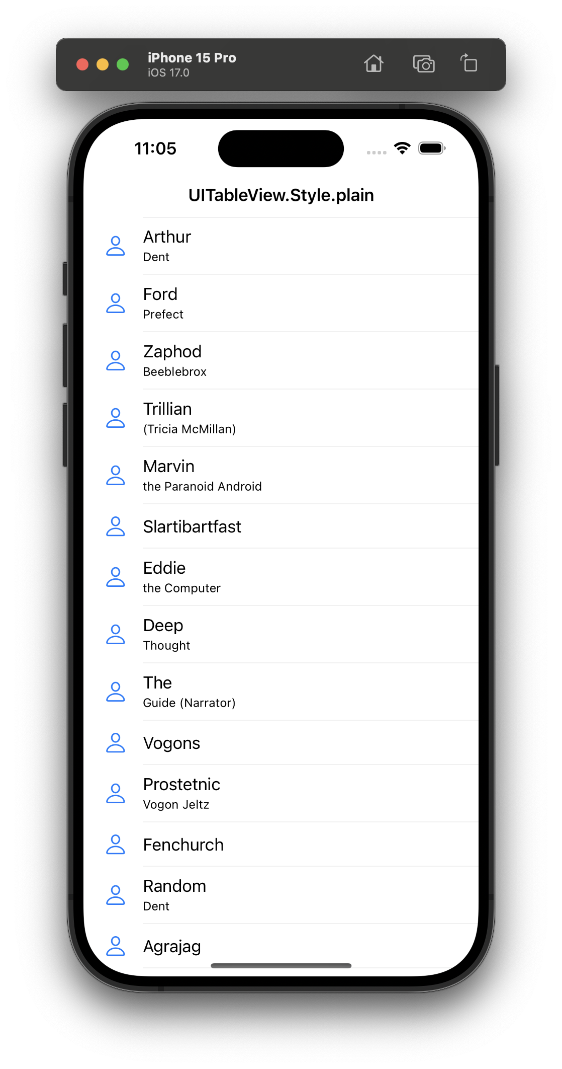
The default. Rows run the full width of the table, and section headers and footers are sticky — they pin to the top as you scroll past them. This is the style for long, uniform lists where the content is the point: a mail inbox, a list of contacts, search results. If you're showing one continuous stream of similar rows, reach for plain.
Appearance grouped ↴
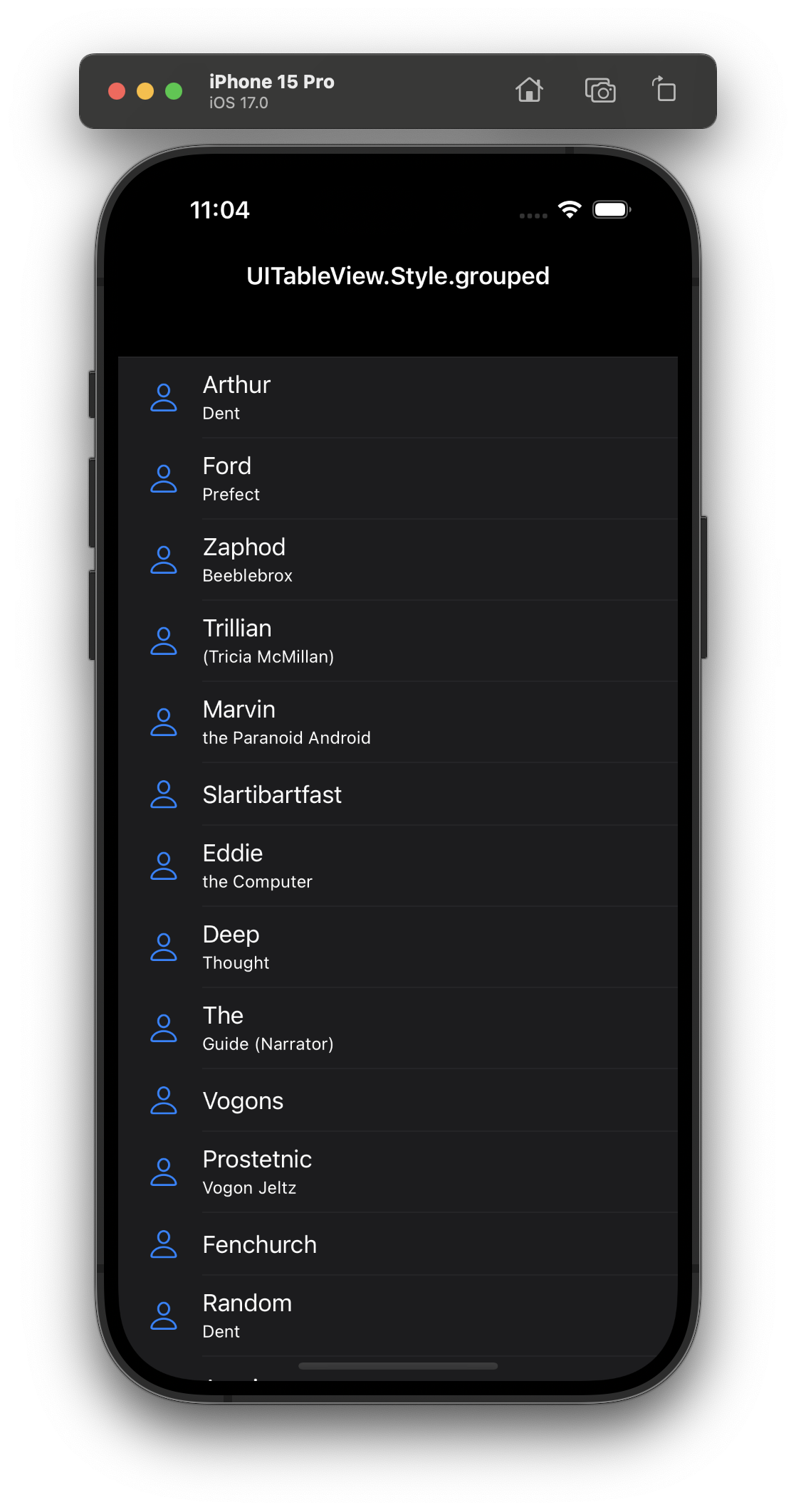
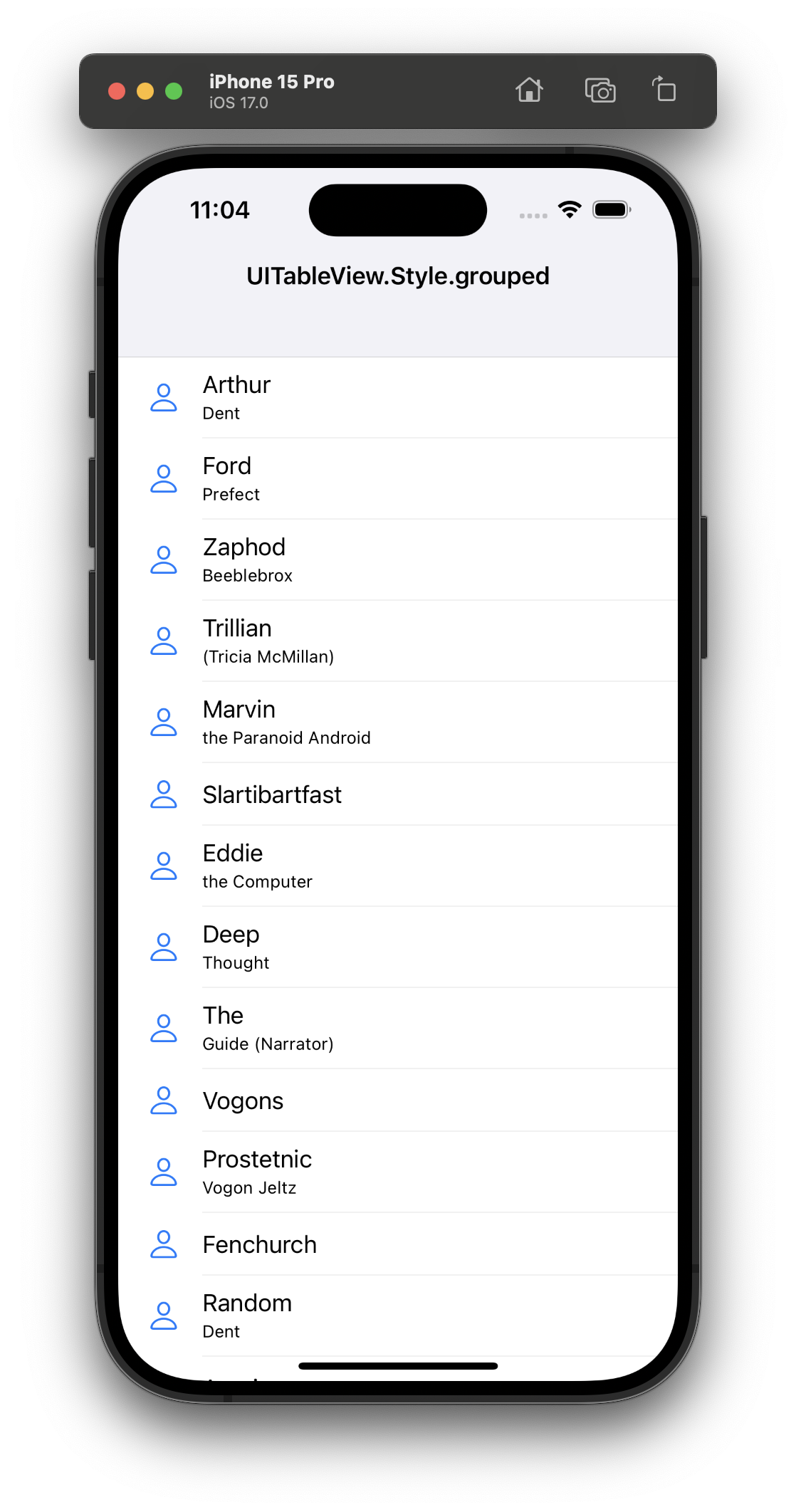
Sections become visually distinct blocks separated by spacing, and the headers scroll away with the content instead of sticking. Rows still span the full width. This was the look of Settings before iOS 13, and it still fits when you have a handful of clearly-labelled groups and don't want the inset-card styling.
Appearance insetGrouped ↴
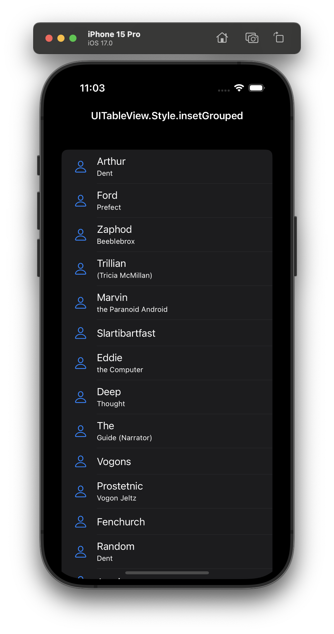
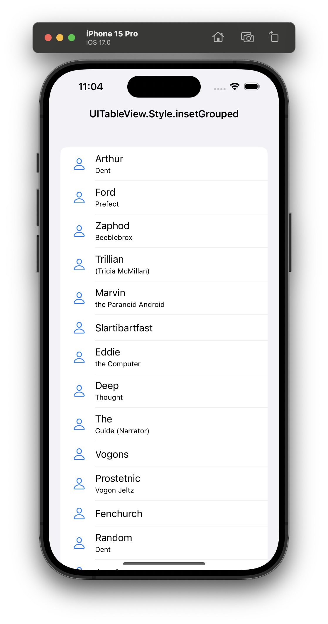
Introduced in iOS 13, this is grouped with the rows pulled in from the edges and given rounded corners, so each section reads as a card floating on the background. It's the modern Settings look, and my default for anything form-shaped — preferences, account screens, anything with labelled fields in short groups.
Setting the style
You choose the style once, at initialisation:
let tableView = UITableView(frame: .zero, style: .insetGrouped)
Two things worth knowing. insetGrouped is iOS 13+, and style is read-only after init — there's no switching a table view's style at runtime. If you need to toggle it, you recreate the table view (or set it in your storyboard/xib up front).
Beyond UITableView
The same three appearances follow you across UIKit and SwiftUI:
- In SwiftUI:
List { … }.listStyle(.plain),.grouped, or.insetGrouped. - In a modern compositional-layout list:
UICollectionLayoutListConfiguration(appearance:)takes the same.plain/.grouped/.insetGrouped— plus.sidebar, whichUITableView.Styledoesn't have. If you're building list UI with collection views, that's the route, and I covered the cell side of it in Default List Content Configurations.
Which one should you use?
- Long, uniform list?
plain. - Settings or a form with grouped fields?
insetGrouped. - Grouped sections but you want the classic full-width look?
grouped.
When in doubt in a modern app, insetGrouped is the safe, native-feeling default.
Source repo used to generate the windows in the screenshots above.