Swift Default Font Styles
By Stefan Schmitt · 2022-12-10
Instead of hard-coding point sizes, Apple's platforms give you a set of semantic font styles — body, headline, caption, and friends. You pick the role the text plays and the system picks the size, weight, and leading, scales it with the reader's text-size setting, and adapts it per platform. It's the difference between "17-point system font" and "this is body text" — and the second one ages far better.
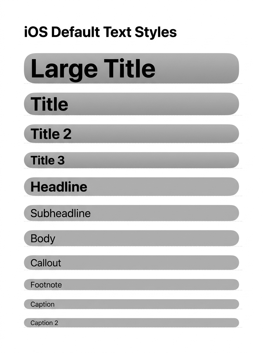
There are eleven of them, from largeTitle down to caption2. Using one is a one-liner:
// SwiftUI — scales with Dynamic Type automatically
Text("The quick brown fox").font(.largeTitle)
Text("The quick brown fox").font(.body)

// UIKit — opt in to Dynamic Type scaling
label.font = UIFont.preferredFont(forTextStyle: .body)
label.adjustsFontForContentSizeCategory = true
(UIKit spells two of them slightly differently — .title1 and .caption1 where SwiftUI has .title and .caption — but they map to the same styles.)
Why bother, over a fixed size? Three reasons: the text scales with the user's Dynamic Type setting on iOS and iPadOS (an accessibility win you get for free), it stays visually consistent across your app, and the same style renders at platform-appropriate metrics — which is exactly what the two screenshots below show.
on Mac ↴
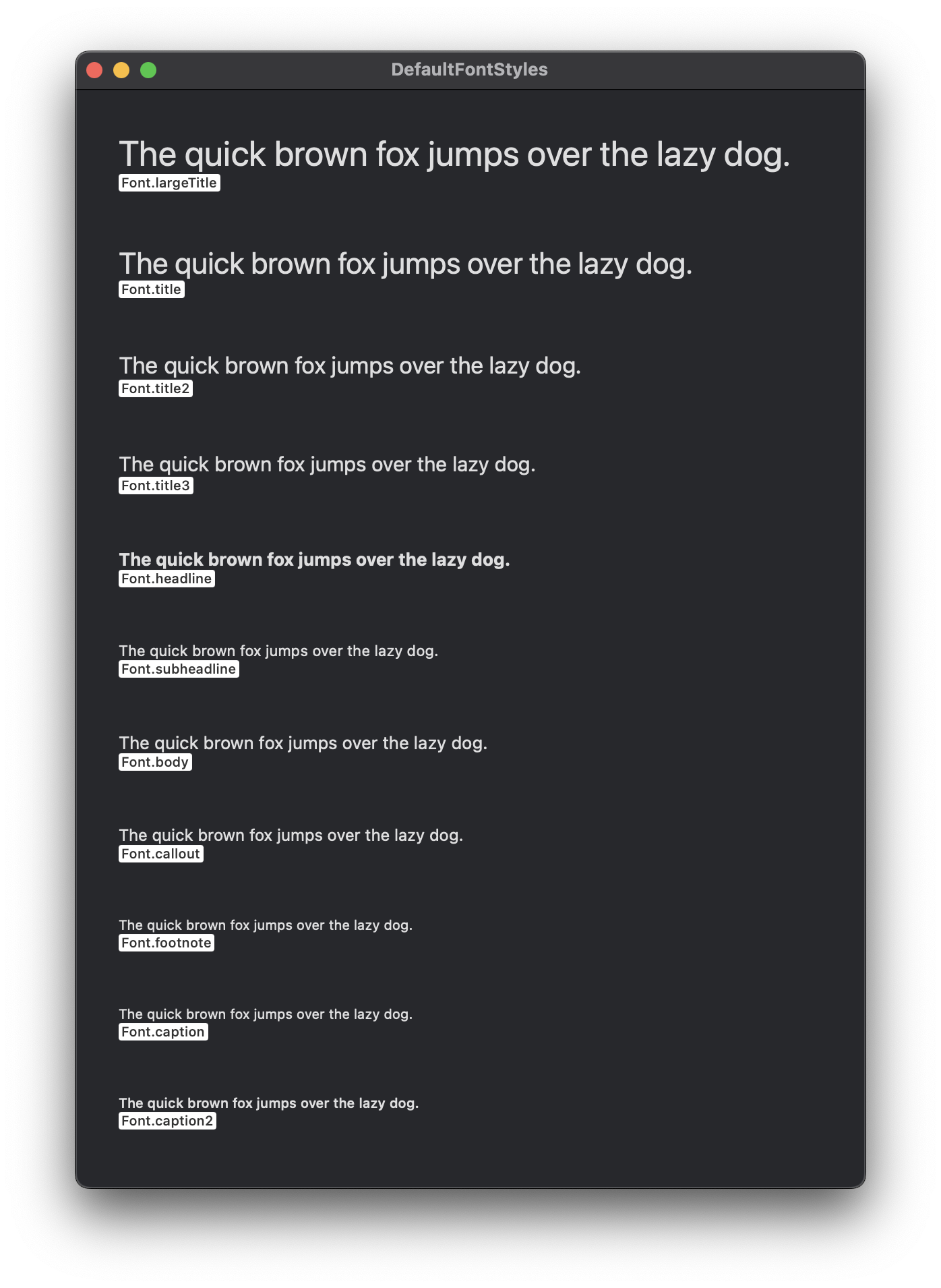
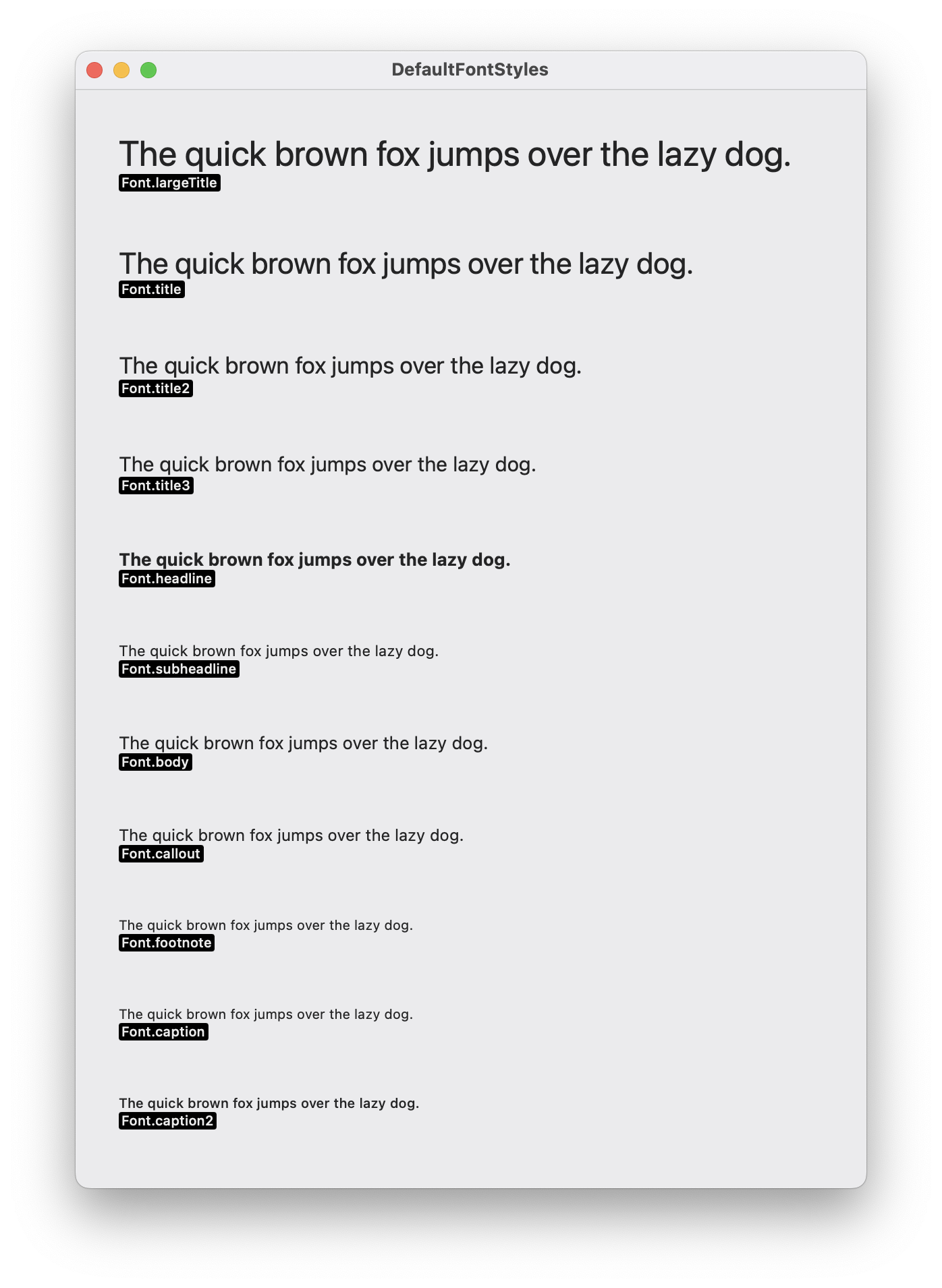
On the Mac the styles run a touch tighter — a body here isn't the same point size as a body on iPhone. macOS doesn't expose the iOS-style Dynamic Type slider, but reaching for the semantic styles still gets you Mac-correct sizing and keeps a shared SwiftUI codebase looking right on both platforms.
on iOS ↴
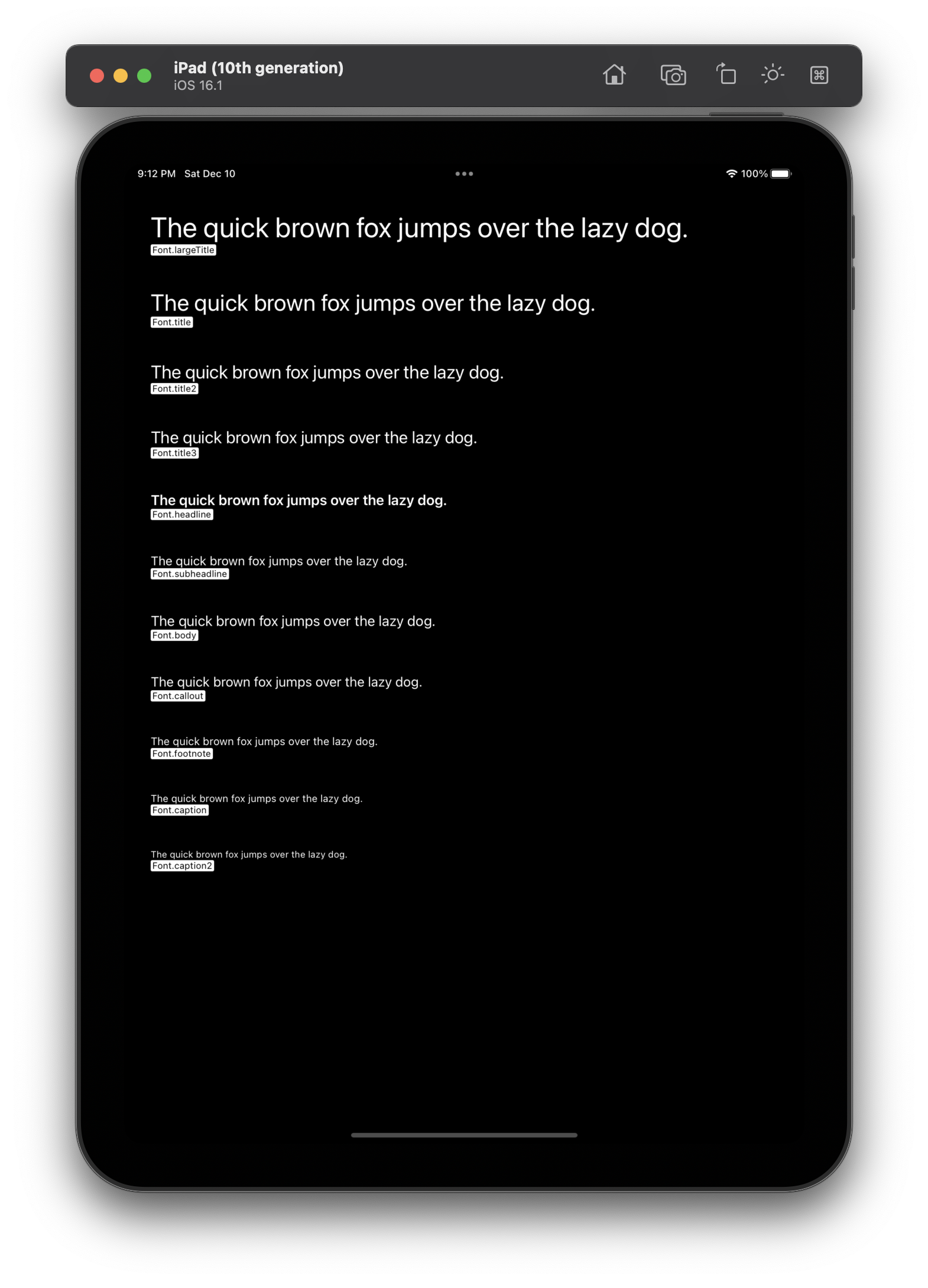
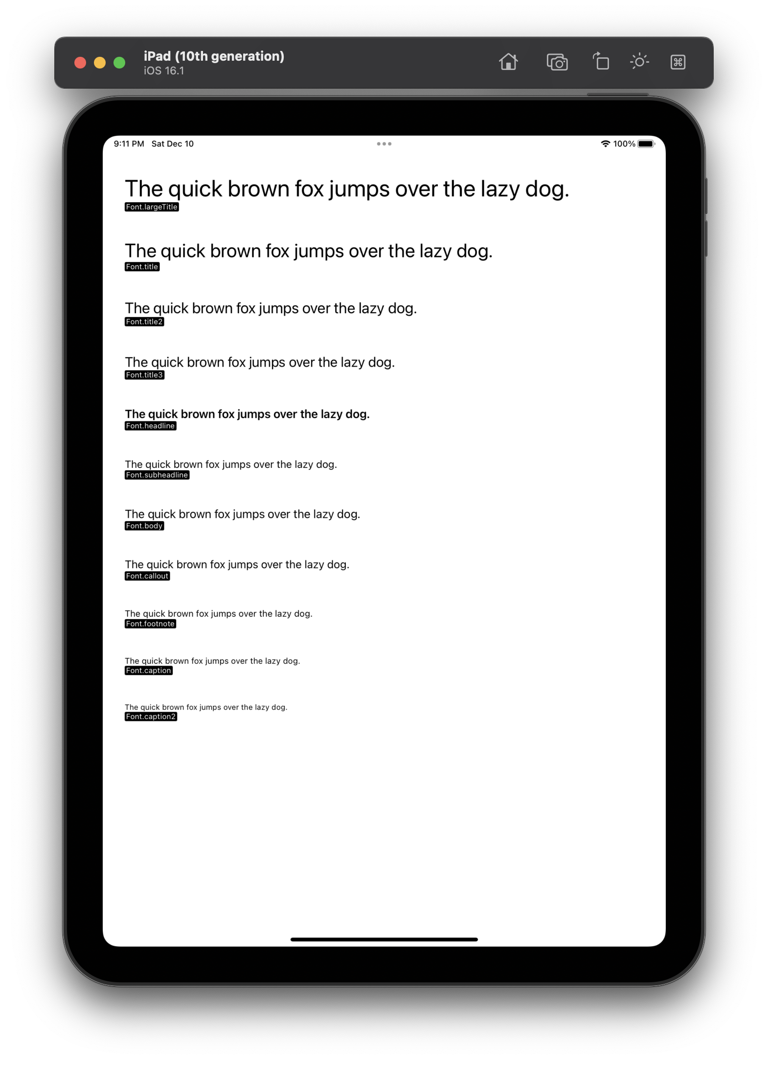
On iPhone and iPad these are the sizes you see throughout the system UI, and they grow and shrink with the user's preferred text size. Build with them and your layout respects that setting without any extra work.
Source repo used to generate the windows in the images above.